Falling Back in Love With PowerPoint!
Power. Point.
A tool to house all of your many many bullet points in a clean linear fashion. We all know that if you put information into a bullet point, then it will be automatically understood. And the more bullet points you fit on a slide, the more information you will teach your audience. It’s brilliant.
And it is Power Point that makes it so. We can animate them, change their font color, and give them screechy sound effects. And the wilder the animation is, the more people will absorb the wealth of information that they hold. Power Point is awesome for making our bullet points feel so special.
So I’m beating a dead horse here. Everyone has heard of Death by Power Point and how its usage will forever taunt us in its boring-dom.
But as a designer who gets paid to use PowerPoint on a daily basis to illustrate important facts and processes, He and I have developed an understanding. Power Point has limitations, and I push them.
Through this process of “Sorry user, I can’t do that” and “Oh wait, maybe I can”, I’ve found a way to resurrect it, pushing its potential and making it an invaluable tool in my instructional design world.
Now if you are already a guru, this post isn’t for you. But if you’ve found yourself falling asleep as you’re building your own decks, you may want to stick around.
So here are a few tips to defibrillating your PowerPoint deck.
If you have a point to make, don’t use a point.
As instructional designers, we’ve all tried to explain the specifics of something to someone only to have someone stare back at us blankly. Then we follow up with “It’s like when you… insert metaphor here”. All of the sudden the bell goes off in their head and you can move forward with the conversation.
So skip the bullet points and start animating the metaphor. Before you know it, you will be telling the whole story solely through the use of graphics. Once you start, you just can’t stop!
Here’s a few bullet points to ease you into the idea:
- Think about what you are trying to say, the images you’ll need to say it, and start getting your graphics together.
- Arrange your graphics on the page exactly how you want them to look in the end.
- Animate your story.
“I’m going to need a turkey, a tree, and a robotic army”, search.
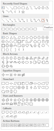
Embrace the Auto Shapes.
Flat graphics are in style now which makes it easy to create them yourself.
Oh, you think you will need some fancy tool to do this?
Think again.
In PowerPoint, you can actually create your own graphics and save them as .pngs, getting exactly what you need in really half the time it may take you to search for it.
Here are a few that I’ve created:

Now I know you think that’s cool… so go ahead, take a moment to open up the ol’ PowerPoint and I’ll walk you through a quick tutorial:
With any auto shape there is the “Edit Points” feature. Simply choose a basic shape you want to start with (head = circle) and then right click to select “Edit points”. You have now unlocked a WORLD of possibilities in creating your own graphics!
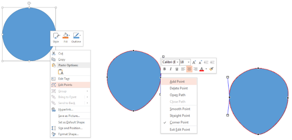
Each of the black handles allows you to drag it to the location you want, altering the basic shape.Notice some extra white boxes sticking out? Move them back and forth to give your straight lines some curves. If you happen to be familiar with the pen tool from other graphics software, it’s the exact same thing. You can even hold down the ALT key to operate one white handle at a time. You can add points, delete points, drag points… anything you want to get the shape you need.
Once you get comfortable with the standard shapes (or if you are like me you saw potential as soon as you saw “Edit points”) use the free form shape tool to draw whatever shape you want, and then use the handles to smooth it out.
Format the shape colors and lines to whatever you want and begin layering other shapes on top of it to create your image.
Once you have the graphic looking how you want it, “Group” all the shapes together, right click on the group and click “Save as Picture”. It will generate a transparent .png for you to use to your heart’s desire. This also allows you to keep your PowerPoint ‘light’, allowing you to focus on the story instead of file size.
Whoa, PowerPoint just got a little cooler.
Compose yourself.
So once you’ve had your heart’s fill of creating custom graphics (which by the way, has anyone thought of creating their own database of copyright free stock graphics with these yet?), you’ll need to arrange your page.
Think of your PowerPoint slide as a movie screen, and concentrate on what you want your final image to look like.
A great rule of thumb for this is the “Rule of Thirds”
The rule of thirds is basically a formula to let you know where and where not to place your graphics so it is the most visually pleasing.
It’s a simple tool that works every time: divide your slide in 3 both horizontally and vertically. When placing your graphics on the page, make sure they fall into one of the quadrants. If you decide to divide your slide in half horizontally, then make sure within those halves that you are placing graphics or content in thirds vertically.
Another trick?
Go off the page. You do not have to work within the confines of a 3:4 or 16:9 slide. By sliding pieces of your graphics off the page, you are subconsciously suggesting that there is more to the story.
Just like designing content around learning objectives, knowing where you want things to end up makes it easy to animate how they get there.
Animate like an animator.
When you are watching an animated film, how often do you notice the transition from once scene to the next? Or how often do characters appear on screen using a swivel and rotate transition. If you don’t know, I’ll tell you. Never.
So why do we try and use the flashiest craziest animations and transitions in our PowerPoint decks? Beats me.
The most powerful animations in PowerPoint are Fade, Appear, Disappear, wipe, Fly In and up, down, left, right motion paths. I occasionally throw in a zoom if I’m feeling a bit crazy.
By combining these basic animations with some of the emphasis animations like teeter, color change, and pulse, you can fake the effects found in animated movies, creating a cinematic motion graphics experience using plain old Power Point. Don’t believe me? Take a look at these examples and see if you can figure out that animations I used:
BTW: Did you know that PowerPoint makes its own videos? (sweet!)(File>Export>Create a Video)
So dust off your knowledge of PowerPoint and try pushing it to its limit!
You may find that you’ll never use another bullet point again! (Calm down now, there is still a place for the bullet point in today’s world). However, you may find yourself giving new life to an age old tool, and even better, staying awake through your own material!

Full Course: Virtual Presentation Power (1 day)
Click here for our full list of available courses!


Great article. These ideas are so creative and helpful. Thank you!